2. Building pages
Now that we have our app using the UI Shell, it’s time to build a few static pages. In this step, we’ll become comfortable with the Carbon grid and various Carbon components.
- Fork, clone and branch
- Add landing page grid
- Build landing page
- Style landing page
- Add repo page grid
- Build repo page
- Style repo page
- Submit pull request
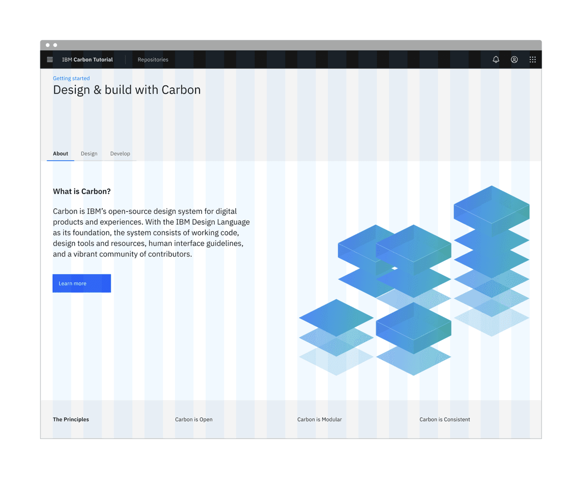
Preview
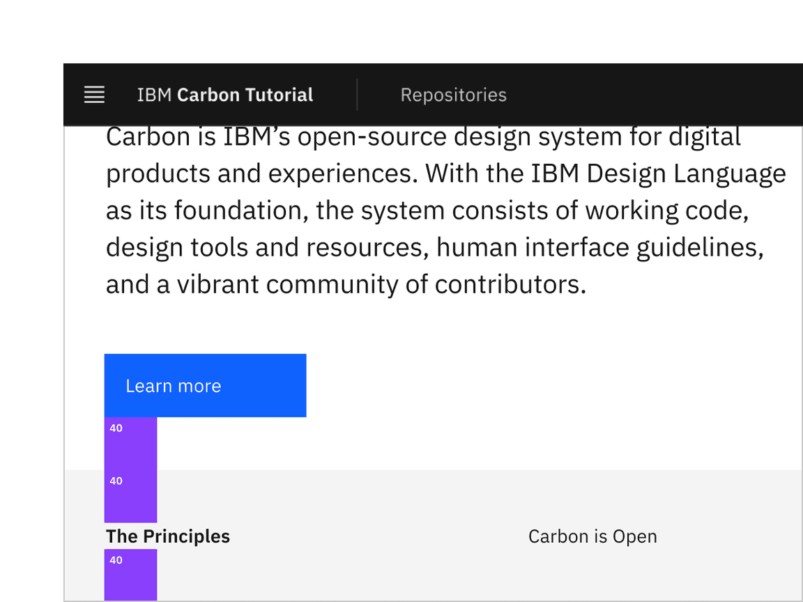
A preview of what you’ll build:
Fork, clone and branch
This tutorial has an accompanying GitHub repository called carbon-tutorial that we’ll use as a starting point for each step. If you haven’t forked and cloned that repository yet, and haven’t added the upstream remote, go ahead and do so by following the step 1 instructions.
Branch
With your repository all set up, let’s check out the branch for this tutorial step’s starting point.
git fetch upstreamgit checkout -b v11-next-step-2 upstream/v11-next-step-2
Build and start app
Install the app’s dependencies (in case you’re starting fresh in your current directory and not continuing from the previous step):
yarn
Then, start the app:
yarn dev
You should see something similar to where the previous step left off.
Add landing page grid
Let’s add our grid elements to our
LandingPage
In order to use the grid, we need to wrap everything in a
<Grid>
<Column>
The CSS Grid is a 16 column grid. We will specify the span of a
<Column>
sm
md
lg
<Column sm={2} md={8} lg={8}/>
We’ve included the designs for this tutorial app in the
design.figma
carbon-tutorial
Landing page grid
First, we need to import our grid components at the top of
LandingPage
'use client';import { Grid, Column } from '@carbon/react';
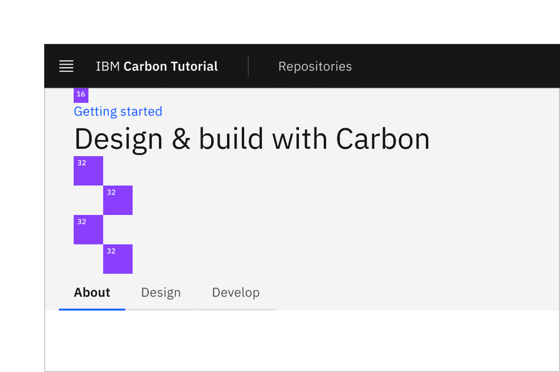
We’ll break this down into three rows. The first row with the gray background doesn’t appear to need any columns. The second row with the white background looks like it has two columns of different widths. The third row with the gray background looks like it has four columns of equal width.
We’ll make rows like so:
return (<Grid className="landing-page" fullWidth><Column lg={16} md={8} sm={4} className="landing-page__banner">1</Column><Column lg={16} md={8} sm={4} className="landing-page__r2"><Grid className="tabs-group-content"><Column md={4} lg={7} sm={4} className="landing-page__tab-content">7/16
We added a prop of
fullWidth
landing-page
landing-page__banner
landing-page__r2
Build landing page
We’ll start adding HTML elements and components by row.
First row
In our first row we’ll need a
Breadcrumb
@carbon/react
import { Breadcrumb, BreadcrumbItem, Grid, Column } from '@carbon/react';
We can now add our component to the first row, along with a header, like so:
<Column lg={16} md={8} sm={4} className="landing-page__banner"><Breadcrumb noTrailingSlash><BreadcrumbItem><a href="/">Getting started</a></BreadcrumbItem></Breadcrumb><h1 className="landing-page__heading">Design & build with Carbon</h1></Column>
You may notice that the styles look off. Don’t worry, we’ll fix these later.
Second row
In our second row we’ll need
Tabs
Button
@carbon/react
import {Breadcrumb,BreadcrumbItem,Button,Tabs,Tab,TabList,TabPanels,TabPanel,
Modify the second row to use the
Tabs
<Column lg={16} md={8} sm={4} className="landing-page__r2"><Tabs defaultSelectedIndex={0}><TabList className="tabs-group"><Tab>About</Tab><Tab>Design</Tab><Tab>Develop</Tab></TabList><TabPanels><TabPanel>
The
<TabList>
<TabPanels>
<TabPanel>
<Grid>
<Column>
<Column lg={16} md={8} sm={4} className="landing-page__r2">
<Grid>
Hold up! If you were to run the Equal Access Toolkit to check for accessibility violations, you’d see
Multiple navigation landmarks must have unique labels specified with aria-label or aria-labelledby
Breadcrumb
Tabs
<nav>
aria-label
Breadcrumb
<Breadcrumb noTrailingSlash aria-label="Page navigation">
Same goes for the
TabList
<TabList className="tabs-group" aria-label="Tab navigation">
Next, we’ll need to add some styling overrides to move the tabs to the right on large viewports. Create a file
_overrides.scss
src/app/home
.landing-page__r2 .cds--tabs--scrollable {transform: translateZ(0);justify-content: flex-end;}.landing-page__r2 .cds--tab-content {padding: 0;}
Then in
_landing-page.scss
@use './overrides.scss';
We can now add our images and text for each column in the first
Tab
LandingPage
Let’s import
Image
import Image from 'next/image';<Column md={4} lg={{ span: 8, offset: 7 }} sm={4}><ImageclassName="landing-page__illo"src="/tab-illo.png"alt="Carbon illustration"width={604}height={498}
Now let’s set the image size in
_landing-page.scss
html {background-color: $layer-01;}.landing-page__illo {max-width: 100%;float: inline-end;height: auto;}
Assuming that the second and third tab would have a similar design, we would set them up in the same way. However, since our design specs don’t show those tabs, we’ll leave the code as is.
Third row
The third row will be created in a later tutorial, so we’ll just add the headers for now.
<Column lg={16} md={8} sm={4} className="landing-page__r3"><Grid><Column lg={4} md={2} sm={4}><h3 className="landing-page__label">The Principles</h3></Column><Columnlg={{ start: 5, span: 3 }}md={{ start: 3, span: 6 }}sm={4}
Style landing page
We’ve added basic layout styles in
_landing-page.scss
_landing-page.scss
@use '@carbon/react/scss/spacing' as *;@use '@carbon/react/scss/type' as *;@use '@carbon/react/scss/breakpoint' as *;@use '@carbon/react/scss/theme' as *;
Banner
Banner vertical spacing
Back to
_landing-page.scss
.landing-page__banner {padding-top: $spacing-05;padding-bottom: $spacing-07 * 4;padding-left: $spacing-06;}
Referencing the spacing token table,
16px
$spacing-05
128px
$spacing-07
128px
8rem
Looking at the design, we need a wall-to-wall light gray background behind the banner and also behind the third row. This is a great opportunity to use a Sass mixin. We could put this at the top of
_landing-page.scss
_mixins.scss
src/app/home
Add the following in
_mixins.scss
$layer-01
@use '@carbon/react/scss/spacing' as *;@use '@carbon/react/scss/theme' as *;@mixin landing-page-background() {background-color: $layer-01;position: relative;}
After you have created
_mixins.scss
_landing-page.scss
@use '@carbon/react/scss/spacing' as *;@use '@carbon/react/scss/type' as *;@use '@carbon/react/scss/breakpoint' as *;@use '@carbon/react/scss/theme' as *;@use './mixins.scss' as *;@use './overrides.scss';
Now to use the new mixin, update the
.landing-page__banner
.landing-page__banner {padding-top: $spacing-05;padding-bottom: $spacing-07 * 4;padding-left: $spacing-06;@include landing-page-background;}
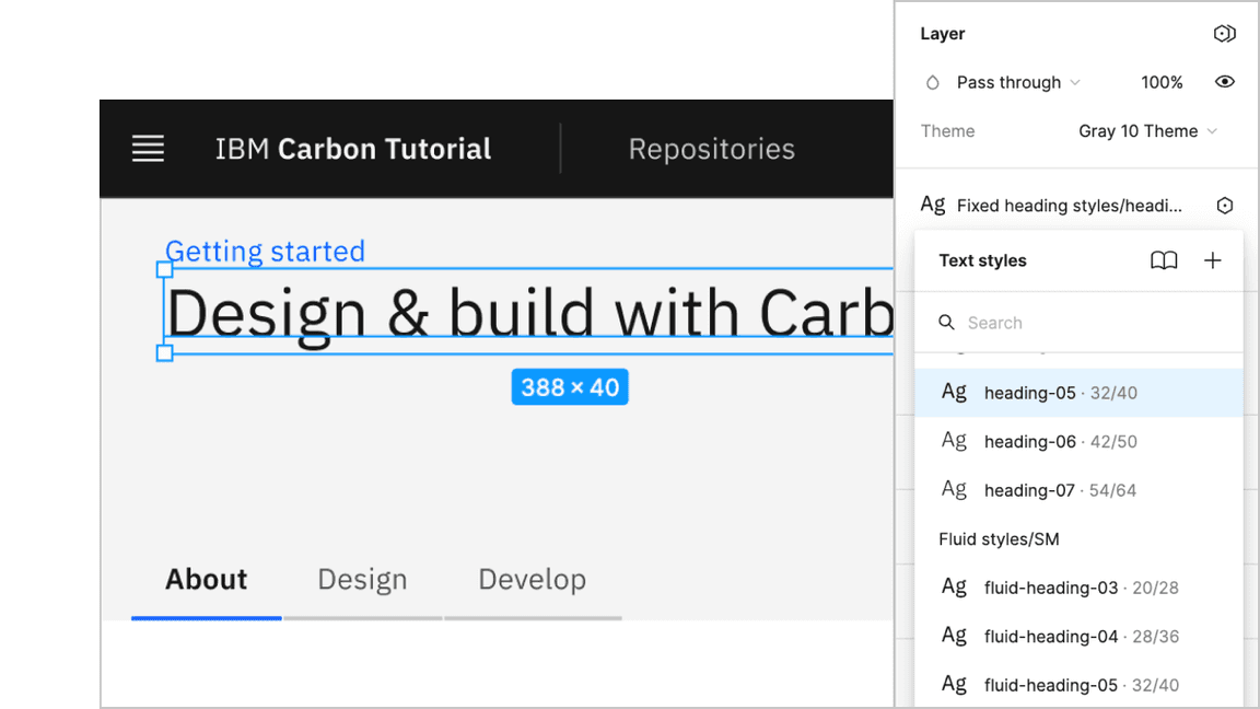
Next, we can see that the
h1
heading-05
Banner heading type
The Sketch symbol naming is consistent with the development Sass tokens to help translate design to development. So, looking up the type token, we know to use
productive-heading-05
.landing-page__heading {@include type-style('productive-heading-05');}
Row two
For our second row, we need to fix the tabs vertical positioning to match the design. By inspecting the tabs component, you can see that the tab height computes to
40px
.landing-page__r2 {margin-top: rem(-40px);}
We also need to adjust our vertical spacing and type treatment. Like before, it’s a matter of using spacing and type tokens like so:
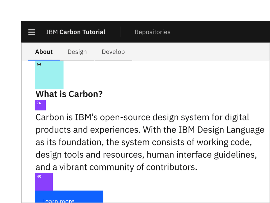
Row 2 vertical spacing
.tabs-group-content {padding: $spacing-10 0 $spacing-10 $spacing-06;}.landing-page__subheading {@include type-style('productive-heading-03');font-weight: 600;}
Row three
Row 3 vertical spacing
Let’s also add some styles for the last row, even though that will get used later in the tutorial. You’ll notice that we get to re-use the
landing-page-background
.landing-page__r3 {padding-top: $spacing-08;padding-bottom: $spacing-08;padding-left: $spacing-06;@include landing-page-background;}.landing-page__label {@include type-style('heading-01');
Lastly, we’ll fix some grid alignment issues along with the image size for smaller screens and the HeaderGobalAction component. We’ll use one of our breakpoint mixins for the media queries, like so:
.landing-page__banner,.landing-page__r2,.landing-page__r3 {margin-left: -20px;margin-right: -20px;@include breakpoint-down(md) {margin-left: 0;margin-right: 0;
@media (max-width: 320px) {.action-icons {display: none;}}
We are almost done with the landing page. You may notice a few styles are off. To fix this, we’ll update some of the overriding styles in
globals.scss
.cds--content
padding: 0;
.cds--content {margin-top: 3rem;padding: 0;background: var(--cds-background);}.cds--content .cds--css-grid {max-width: 100%;@include breakpoint(md) {
Since we are using our
breakpoint
@use '@carbon/react';@use '@carbon/react/scss/breakpoint' as *;
Ta-da! You should see a finished landing page! Now we can move on to the repo page.
Add repo page grid
Now in our
RepoPage
src/app/repos/page.js
Grid
'use client';import { Grid, Column } from '@carbon/react';
Then add our grid containers in the
return
return (<Grid className="repo-page"><Column lg={16} md={8} sm={4} className="repo-page__r1">Data table will go here</Column></Grid>);
Build repo page
We currently have
RepoPage
DataTable
RepoTable.js
page.js
src/app/repos
Build data table
First, we’ll add our data table by importing a few components in
RepoTable.js
import React from 'react';import {DataTable,TableContainer,Table,TableHead,TableRow,TableExpandHeader,TableHeader,
Then, let’s create the
RepoTable
RepoTable.js
const RepoTable = ({ rows, headers }) => {return (<DataTablerows={rows}headers={headers}render={({rows,headers,getHeaderProps,
This component uses two props,
rows
headers
DataTable
Table*
At this point, return to
RepoPage
RepoTable
Render data table
Import
RepoTable
RepoPage
'use client';import RepoTable from './RepoTable';import { Grid, Column } from '@carbon/react';
Then below the imports, include the following arrays to pass into the
RepoTable
rows
const headers = [{key: 'name',header: 'Name',},{key: 'createdAt',header: 'Created',},
Lastly in
RepoPage
Data table will go here
<RepoTable headers={headers} rows={rows} />
Style repo page
Our styles for the repo page are mostly fine. We just need to update a few vertical spacing issues.
In
_repo-page.scss
@use '@carbon/react/scss/spacing' as *;.repo-page__r1 {padding-top: $spacing-05;padding-bottom: $spacing-05;}
Congratulations! We’ve now created our static repo page!
Submit pull request
We’re going to submit a pull request to verify completion of this tutorial step.
Continuous integration (CI) check
Run the CI check to make sure we’re all set to submit a pull request.
yarn ci-check
Git commit and push
Before we can create a pull request, format your code, then stage and commit all of your changes:
yarn formatgit add --all && git commit -m "feat(tutorial): complete step 2"
Then, push to your repository:
git push origin v11-next-step-2
Pull request (PR)
Finally, visit carbon-react-tutorial to “Compare & pull request”. In doing so, make sure that you are comparing to
v11-next-step-2
base: v11-next-step-2